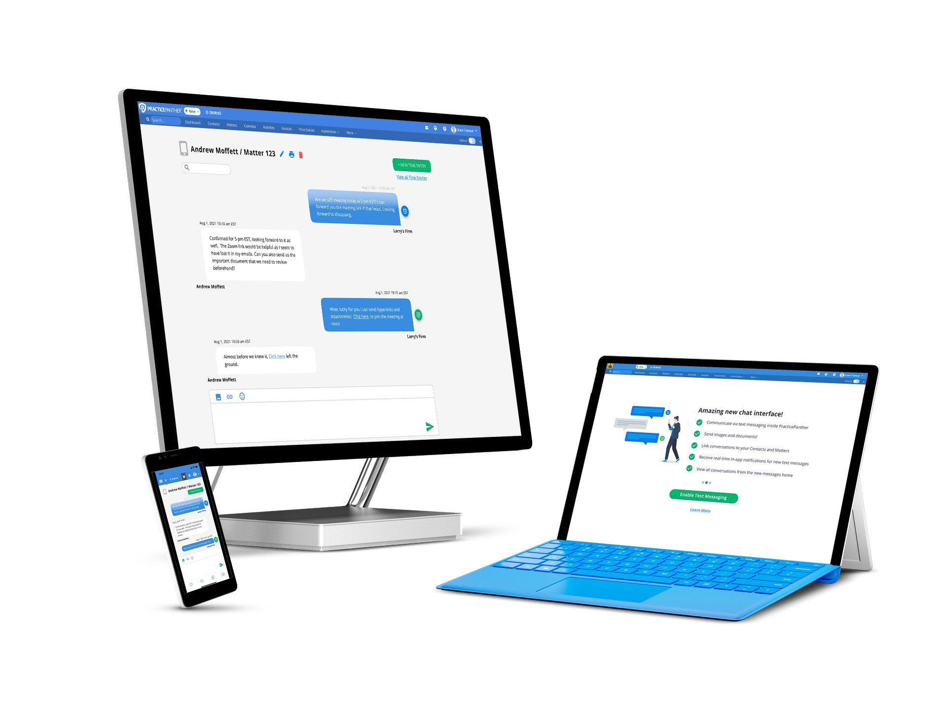
Leading design for a new feature
PracticePanther Text Messaging
Scroll ↓
How might we…
create a native 2-way text messaging feature so that Lawyers can have faster communication with their clients, quickly track time spent in the conversation, and send payment links to get paid sooner - all from a designated professional mobile phone number without leaving PracticePanther?
About the Project
PracticePanther is a leading law practice management software product. During my time as the solo Product Designer at PracticePanther, a text messaging feature had been highly requested. Lawyers were frustrated having to maintain communication with their clients from their personal mobile numbers and wanted an easier way to share payment links. It was also difficult to track time spent on text message communications for billing purposes. This was the first new feature at PracticePanther to be designed using the full product design process that I had implemented from start to finish. This feature resulted in a successful adoption rate, continued enhancements, and customer satisfaction. Studies have shown that in general 50% of development time can be spent fixing UX issues that would have been found with better user research, and this process definitely prevented post-launch fixes.
Surveys
We started the design process off by surveying users who had shown interest in the text messaging feature. The purpose of this user survey was to answer any pending questions we had prior to initial designs. We needed to get a greater sense from users about their text messaging usage, why they would choose texting over alternative communication methods, which automation functionality would be most helpful, and the type of message searching functionality they’d need most. Some big takeaways were that we would need to account for 200+ messages per month per user and that firms expect to be reaching out to their clients via text message more often than they would be receiving messages.
User Flows
Design Kickoff
To kick off designs, I started with some lo fidelity sketches to show internally and gain alignment. The goal was to make a text messaging feature that felt as intuitive as texting on your phone but with all the perks of having messages tracked and stored in your practice management software. We also wanted to make sure we were making the feature extremely mobile friendly! Once we agreed on the sketches for our main screens such as the conversation screen and text message grid for tracking all conversations, we moved on to mid-fidelity
First Iterations
For mid-fidelity mockups, I focused on more of the flows such as the onboarding flow where users can enable text messaging and get assigned a professional mobile phone number (no more texting clients from a personal phone number!) I created Figma mockups for the conversation and grid screens as well. UI details weren’t the priority here, as we wanted to make sure all the necessary content for full functionality was included in the designs. We sent these designs around for more internal feedback, and iterated to include a “buddy bar” on the left hand side of the conversation screen to show users previews of their other text message conversations.
First Draft Before Usability Testing
With our internally driven iterations, I added UI details consistent with the PracticePanther branding and completed a fully interactive prototype for continued feedback loops, internal Figma comments, and finally usability testing. We wanted to make sure users would have an easy time successfully navigating new message previews and the new messages grid, as well as initiating and sending a text message. We also wanted to get some qualitative feedback on our designs from users prior to development. Our biggest iterations after usability testing were making time entries for individual messages more obvious; making it clear when a time entry has already been entered for a message; and making the conversation UI less cluttered and confusing by removing message previews.
Usability Test Findings
-

New message previews
We showed users the new message preview from the dashboard and asked users where they would click to initiate a new text message. Most users were successful. We received feedback that users preferred a text message bubble over the previously used mail icon, so we made that iteration.
-

Time Entries
We asked users where they would click to log a time entry as well as where they would click to log a time entry for their most recent message. Users had a more difficult time with this task. We wanted to improve here! Feedback indicated that the clock next to individual messages was too small, and that users would find it helpful if there was an indication that a time entry had already been done.
-

Sending a text message
We A/B tested two different designs for sending a new text message. We also asked users where they would click to enter info for a client who isn’t a contact in PracticePanther. 59% of users preferred option B (shown here) and 84% of users accurately chose “enter a phone number” to enter information for a client who isn’t a contact in PracticePanther. We also got feedback that users wanted to be able to link the conversation to specific matters, which we incorporated!
-

Conversation UI
We asked users what they thought is shown in the left sidebar. There was more confusion here and we also received feedback that the UI felt cluttered, overwhelming, and “too busy with the menu on the left”. In addition to this feedback, we received internal feedback that the additional menu would substantially add to development time.
Final Result
After we iterated based on the usability test findings, we had our final designs and made sure mobile designs were optimized. Key KPIs included ~99% message deliverability success rates and ~160k outbound messages over 18 months which exceeding expectations.


