Leading design for a new payments feature
Bill4Time Link2Pay
Scroll ↓
How might we…
establish trust through a flexible online payment system supporting independent law firms and their clients?
About the Project
Bill4Time is a legaltech solution specializing in time and billing. Bill4Time Payments had recently launched when I started as the solo designer at Bill4Time. This new native payments feature allows law firms to collect and track payments on the same product as all their time and billing. As an enhancement to the feature, we needed to provide users with a way to send customizable payment links to their clients to streamline the payment process and help our users get paid faster! This was a heavily requested feature and a logical next step. User research had been conducted prior to when I joined that confirmed the need for payment links and also confirmed what options needed to be included when creating a template. I jumped right in to take what we already knew and create a simple, beautiful experience with our newly updated design standards and heavy usability testing.
Requirements
We knew we needed users to be able to create a link using a template which would offer customizable options such as:
a preset amount
which bank funds should be deposited to
the account manager
a note for the client
whether client/matter information should be required
whether a client should be allowed to enter notes
We also knew that the user needed to be able to copy the created links, edit the template information, delete unwanted links, and preview the end-client experience before saving.
Design Iterations & Internal Feedback
Since we already knew our design system and how that would factor into the designs, we focused on gathering feedback internally through Figma comments and design sessions. During my design process I created multiple versions of each screen, especially for the template creation page and designs evolved through our feedback loops. From here we were able to narrow our options down to three variations, each of which treated “Preset Amount” differently.
Since we couldn’t come to an agreement internally, we turned to usability testing!
Usability Testing
Our goal in usability testing was to determine hierarchy and priority of fields in the table of templates and the template builder itself. We took over 50 participants through a series of tasks and heat mapped their clicks to learn more.
Table of Link2Pay Templates
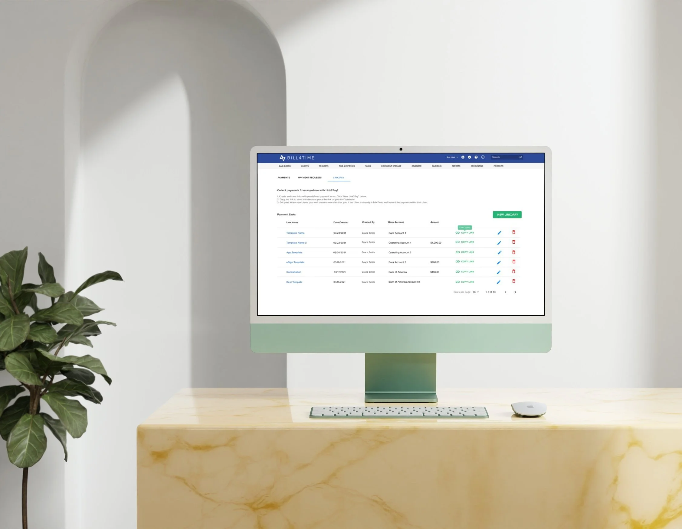
To start off our usability test, we asked current Bill4Time Payments users where they would click to create a new link from this grid view of Link2Pay. We then asked them to copy an existing link and also delete a link. Our biggest need for improvement here was the “Copy Link” button being too similar to the “New Link2Pay” button. A lot of users clicked to copy a link when we asked them where they would click to create a new Link2Pay template. We also received feedback in our follow-up question saying that they found the “Copy Link” button distracting and that the term “template” here was intimidating or confusing.
Template Creator Modal
One element we couldn’t decide on as a team was whether “request preset amount” should exist as a toggle in “Template Information”, a toggle in “Options” or as a “Preset Amount” field that is always optional. In order to test this out, we created three different versions of our usability test which were identical except for the design of this one field, and sent each to a third of our randomly selected users. When we asked users where they would click to request a preset amount, the optional field had the highest success rate. We also tested out the “preview template” and “save” functions and people were successful without any blockers.
Most Important Fields
Final Iterations
-
Based on repeated feedback from users and our analysis of the heat maps, we decided to change the design of the “Copy Link” button to make it less distracting.
-
There were a lot of questions asked by multiple users about what a template is, such as “I do not understand what these templates are " and "I still do not understand the need for a template when you have request a payment".
To mitigate confusion, we decided to remove all “template” verbiage and replaced it with more payment link focused verbiage.
-
Based on the success rate of our test versions, we decided to opt for “Preset Amount” coming out of the toggle and becoming an optional field.
-
The most important fields according to users were “Message for Clients”, “Bank Account”, “Preset Amount”, and “Allow Client to Enter Notes”. Based on this feedback, we gave users an optional “Message for Clients” field instead of having to toggle it on. We also decided to always allow the client to enter notes since there was no harm seen in allowing payment notes, especially since most people wanted their clients to provide notes anyway.
At the end, our only toggles left were for requesting Client/Project IDs!
Final Product
Payments at Paradigm (Bill4Time, PracticePanther and MerusCase) reached $200M annual processing volume within 18 months of acquisition. Paradigm was then bought out in early 2022 for $400M by Francisco Partners.


